We build and support awesome & affordable websites for individuals, small businesses and non-profit organizations. We love the little guys, the newbies, the novices… the up-and-comers, the mom and pops and the have nots.
Once your customer is on your checkout page, you’re in the clear, right? After all, they’ve already made the decision to buy from your site, made the decision on the product, and made the decision to click “go to shopping cart”.
They’ve already made so many decisions in your favor, nothing could possibly derail this conversion, right?
…Right?
Way off.
Just because they’re ready to checkout doesn’t mean things can’t go wrong. In fact, there are probably things you’re doing on your checkout page that are costing you conversions.
What are those things? Don’t worry — that’s what this post is all about. So without further ado, here are 3 checkout page tips to help boost your sales:
1. Whatever you do, don’t have customers register before they buy
We understand the impulse to have customers register before they complete a purchase. You want to capture that customer data so you can market to them later, enticing them to become repeat customers (because they’re easier to convert, and spend more).
We get that. But please, for the love of all things holy, have them register after they buy.
Why?
Because that registration form is costing you sales. One retailer found that removing the registration field yielded them an additional $300 million in revenue a year!
Further, the same retailer found that customer feeling toward the registration field is overwhelmingly negative. People feel like they’re being forced to opt-in to marketing they don’t want.
These forms may seem valuable, but they can seriously harm your revenue.
And the registration/login form before a purchase even hurts you with repeat customers. When people can’t remember passwords for their login, 75% of them never complete the purchase when they click “request password”.
All of that should convince you to let customers just buy without registering.
2. Abandoned cart woes? Ditch the email for an exit overlay
As you probably know, shopping cart abandonment isn’t just a headache: it’s a massive business opportunity.
According to a well-known Baymard survey, the shopping cart abandonment rate is somewhere close to 70%, meaning there are billions and billions of dollars being left on the digital table.
Sensibly, most businesses have decided to do something about it, and perhaps the most common solutions seems to be the abandoned cart email.
You’ve probably gotten one before, but if you haven’t, they look like this:
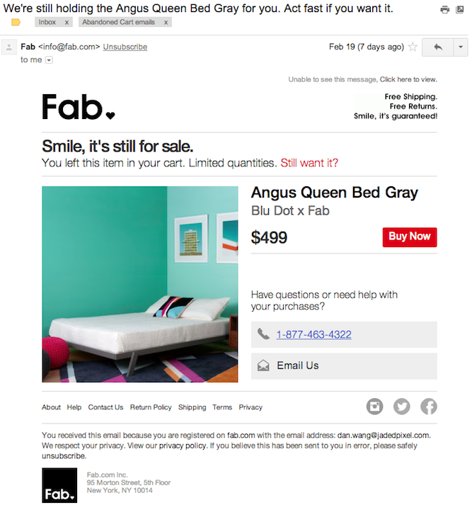 (From Shopify)
The gist is, some number of days or hours after adding an item to a cart and then exiting, the merchant offers you a discount to come back and complete the purchase.
While this email offer can definitely help recover sales, it may not be the best way to do it. An increasingly popular and more recent solution is the exit overlay.
If you haven’t seen the exit overlay in action, here’s how it works:
A customer adds an item to a cart, and if the cursor moves toward the “close” button in the browser, a modal appears, offering them a discount to finish the purchase. It look like this:
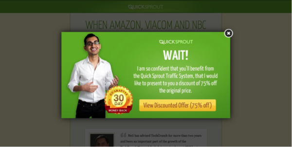
This particular overlay comes from Quick Sprout’s blog.
While both concepts are highly similar, abandoned cart emails only work if:
- you have a customer’s email address
- your email gets through their spam filter
- they open your email
That’s a lot that might not happen, which is why overlays, which are shown to everyone (unless they exit your site via a keyboard command), are better.
In fact, one study found that exit overlays converted at a rate more than twice as high as abandoned cart emails!
3. Have promo codes? List them on your checkout page.
This one might seem a bit counter intuitive. After all, encouraging customers to use promo codes costs you money. Isn’t it better to just apply promo codes when valid and move on?
That may seem like the best move, but in fact, most people these days tend to look for promo codes regardless of where they’re shopping.
Do a quick test here: type in the name of your favorite online merchant and see what comes up.
Here’s what I got:
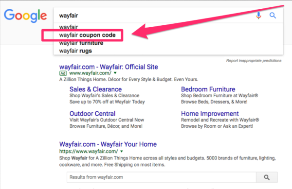
Impressive, right? That indicates that a huge number of people are looking for discount codes!
The point is, if there’s a box that says “Promo Code” on your checkout page, people are going to go to Google and try and find a discount.
And that’s the exact opposite of what you want. What you want is them staying on your page, completing their purchase as soon as possible.
The solution here is a little unorthodox, but here is what Macy’s does:
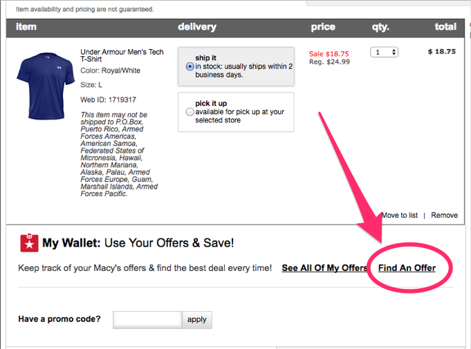
That “Find An Offer” button takes you to a list of their current active promotions.
This allows customers to find what they want — ways to save money — as well as keep the business satisfied — because the customer is never leaving the site. It’s a win-win, and that’s what we all want!
Now, you may not have a promotion list as extensive as Macy’s, but if you have ’em, it makes sense to list ’em.
Wrapping up checkout page tips
After looking at this list of things that help out your checkout page, you’ll notice one trend: it’s all about making things as easy as possible for the customer. It’s easier to get discount codes, it’s easier to complete the purchase without registering, and it’s easier to get promotional offers with an exit overlay. This makes sense, because you’ve already done the hard part — getting them here. Now, you just need to make it simple for them to buy!
Source: TrustedSite


